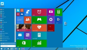
A fresh start
Windows 8 was a bold re-imagining of Microsoft’s operating system, but the Start screen proved contentious. The colorful Live Tiles offer useful notifications and information, but they were designed with
touchscreen devices in mind: much of the work we do in Windows involves keyboards, mice, and large displays chock-full of windows and apps. Windows 8’s Modern apps demand a full screen’s attention, oblivious of our need to multitask. The Windows 10 Start Menu gives us the best of both worlds.
Boot up a PC running the Windows 10, and you’ll be dropped off at the oh-so-familiar desktop. The taskbar and its icons sits on the bottom, and the recycle bin sits in the upper-left corner. It looks, at first blush, like Windows 8 all over again.
But press the Start button, and you’ll be greeted by the return of the Start menu. It’s a proper Start menu too, with your most frequently used apps are stacked in a column. Press the “All Apps” button and you’ll find the endless column of nested folders we’ve all been scrolling since Windows 95, though they’re now grouped alphabetically. Sitting alongside that column are Windows 8’s animated Live Tiles, endlessly serving up news-bites and social network updates.
Windows 10 lets you work smarter, too. Click the Task view button, and you’ll get a quick glimpse of all of your open apps and windows. A black box running along the bottom of the display prompts to create a virtual desktop: that’s a sort of private island that keeps everything you open there as an independent workspace. You can, for example, create one desktop for all of the applications you use for work, another to browse gaming forums or sites like Reddit, and yet another for games or whatever you want. The virtual desktop feature alone tempts me to install this technical preview on my primary machine. Of course we’ve had virtual desktops on Linux and Mac machines for years (and on Windows, from third-party apps), but it’s nice to see Microsoft catching up here.

